


Rating: Liverpool's kit collection for the 2021/22 campaign 💯
There's been a mixed reaction to some of the jerseys online.

Nike have once again come up with a commendably diverse array of Liverpool shirts for the current campaign.
However, the retailer has arguably again failed to hit some consistency across all the jersey designs, with one kit in particular (in our opinion) failing to hit the mark.
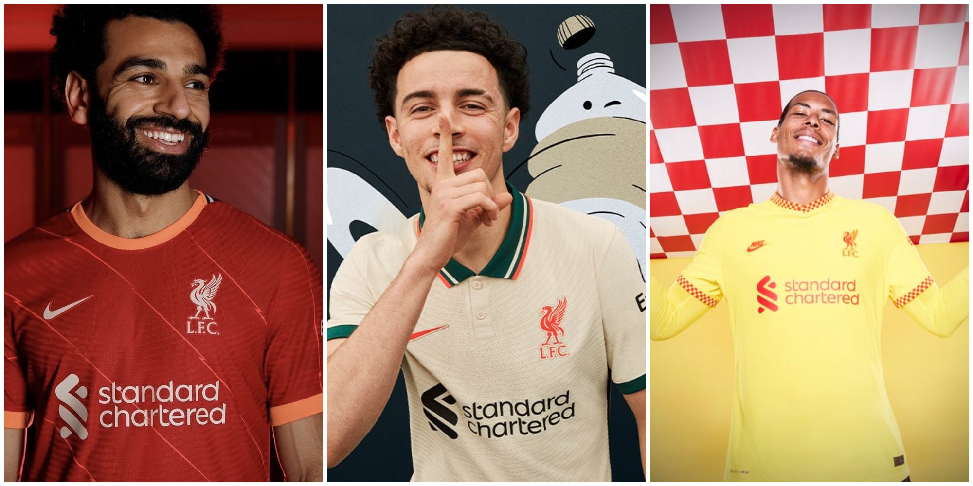
Home - 7/10
The initial reactions to the release of the home kit for the 2021/22 campaign were, in our minds, somewhat underwhelming.
Having said that, it has grown on us since, especially after taking a look at the jersey in person.

The classic red has been softened ever so slightly by the inclusion of some pink/orange trimming around the collar and sleeves, and some lightning bolts of the same hue slashing diagonally down the front and back.
We’re in two minds as to whether this is an improvement on last season’s instalment or not, but we’ll leave that for you all to decide!
Away - 9/10
Instant classic - that’s our view on the matter anyway!
There were some fears that Liverpool could end up with a near-identical set of home and away kits, with a white design bearing similar lightning bolt features briefly making its existence known online.
After dazzling our screens and Anfield with the luxurious turquoise shirt last term, however, Nike have once again gone bold with a somewhat plainer - but no less gorgeous - ecru top.


Befitted with an actual collar, with green, white and pink trimming (a colour scheme the club have persisted with from the home shirt), Nike have come up with a truly special design that we can see fans pointing back to fondly down the decades.
The top’s already sold out on the club’s official store, which already tells you all you need to know about how well-received the kits is amongst the fans.
Third - 5/10
The prospect of a predominantly yellow kit - a colour that has traditionally suited the club on the pitch - was mouthwatering.
From classic Crown Paints numbers to more recent instalments from Adidas and the like, we’ve had some gorgeous pieces to drool over in years gone by.
However, Liverpool’s official reveal via their Twitter account ultimately disappointed as far as we’re concerned.
Nike’s effort with the third kit has seen the brand stick with the chequered theme that was a core feature of last season’s corresponding shirt, but this time they’ve made the inclusion more subtle, keeping it to the shirt sleeve and collar trim.
Bizarrely, it’s had the effect of making it stand out even more and (those of who you’ve witnessed McDonald’s’ and @LFCRetail’s back and forth on Twitter will know where we’re going with this) for all the wrong reasons.


We’ve seen a good number of fans on the Twittersphere express their interest in the shirt regardless, which is still great to see.
Despite our thoughts on the matter, we can accept that supporters may have some seriously divergent opinions on Nike’s efforts for the 2021/22 campaign and we’d love to hear them.
If you’re of fan of this kind of content, all completely ad-free, then feel free to hit the subscribe button below and become an EOTK Insider. Dig into exclusive tidbits reserved only for our subscribers!